The complete guide to user experience metrics
Use the most popular UX metrics to improve the user experience and prove the ROI of your efforts.

Editor’s Note: This guide was written in partnership with Annette Franz, CCXP, CEO, founder of CX Journey Inc.
User experience (UX) is part of the bigger customer experience (CX) ecosystem. Its focus is strictly on the experience a user has with the design of a website, application, or product.
Great UX design means a user can solve a problem or fulfill a need with ease. This intuitive experience results in more satisfied users, higher conversion rates, and fewer technical issues, reducing business costs down the line.
Before you can make improvements to your digital platform(s), you need to understand their current state. To do so, there are two UX metrics that you can leverage: behavioral and attitudinal.
Behavioral metrics focus on how users feel about your product, while attitudinal hone in on how they interact with it, and are based heavily on real-time user feedback. Together, these measurements help you compare and track the quality of the user experience.
This guide addresses how to collect and act on behavioral and attitudinal metrics to deliver the best user experience. We’ll also address how to demonstrate the business impact of your efforts.
Let’s start with key definitions.
The user experience
The term user experience (UX), was popularized by Don Norman, an American researcher and developer, who said that “User experience encompasses all aspects of the end user's interaction with the company, its services, and its products.”
There are many variations of how UX is defined. In his description, Norman tried to be all-encompassing, while others have narrowed the focus. For example, User Experience Network defines user experience as, “The quality of the experience a person has when interacting with a specific design.” In other words, it’s the perception of the interaction with a product or user interface.
User interface (UI) is a subset of user experience. It’s where the user interactions happen, whether it’s via a website, an app, or any other digital platform. UI considers all the visual, interactive elements of a product’s interface—including buttons, icons, spacing, typography, color schemes, and responsive design. The goal is to visually guide the user through a product’s interface.
Another definition of UX that stands out, comes from the User Experience Professionals Association International (UXPA): “User experience is an approach to product development that incorporates direct user feedback throughout the development cycle (human-centered design) to reduce costs and create products and tools that meet user needs and have a high level of usability (are easy to use).”
While it’s advantageous to know the various interpretations of user experience, if you’re looking for a safe bet, here is how we define the term: UX is the totality of the end-users’ perceptions as they interact with a product, app, or website. This can include their experience with an app on their mobile phone, but also covers non-digital or product experiences.
Related: How to use UX surveys to test ideas
Why UX matters
Great UX design is based on solid user research and the intention to address and solve users’ problems and fulfill their needs.
A user should experience ease of use, utility, and sometimes pleasure in every interaction with a product or platform in order to fulfill the business goal of improving customer satisfaction and loyalty.
A properly designed user experience results in more satisfied users and higher conversion rates due to the intuitive experience. An experience that is designed right from the beginning will lead to fewer issues, reducing costs over time.
User experience isn’t a standalone concept—it’s part of the bigger customer experience (CX) ecosystem, which also includes digital experience.

The role of UX in customer experience
Let’s look at three key terms—user experience, digital experience, and customer experience—and how they’re interconnected.
We know that user experience is the sum of all the interactions a user has with a specific design, i.e., a website, application, or product.
Digital experience is the sum of all the interactions that a customer has with an organization via digital touchpoints—website, app, mobile, social media, etc.—over the life of the “relationship” with that company, and the feelings, emotions, and perceptions the customer has about those interactions.
Customer experience is the perception of the sum of all interactions—online and offline—that a customer has with an organization over the life of the “relationship” with that company.
How are these three elements connected?
Customer experience is the umbrella discipline, and user experience and digital experience are subsets. Despite Norman’s definition, UX focuses on user interactions with a product, whereas CX focuses on the customer, who might or might not be the end user.
Also, to transform the customer experience, a CX leader must have all the right foundational elements in place: executive commitment, leadership alignment, a customer-centric culture, governance, a great employee experience, and so much more. There needs to be a holistic, cross-functional approach that is intentional and structured (for example, implementing a voice of the customer (VOC) program).
Another differentiator is that CX zeroes in on emotions, feelings, and perceptions–an enormous part of what an “experience” is or elicits. Not to say that user experience and digital experience don’t focus on this, but many user experience definitions mention nothing about feelings, emotions, or perceptions. Perhaps, for some, it is implied in “utility, ease of use, and pleasure.”
User experience often focuses on usability (of the product) on a specific channel (e.g., app, website), whereas customer experience looks across all channels, interactions, and ways in which the customer engages with the company.
Digital experience focuses on the interactions at digital touchpoints. And, as shown in the diagram below, user experience overlaps with digital experience.

UX design focuses on how the product or the website works for the user, while CX design prioritizes the end-to-end experience (transactions, journeys, relationships).
Steve Jobs said, “Most people make the mistake of thinking design is what it looks like. People think it's this veneer that the designers are handed this box and told, ‘Make it look good!’ That's not what we think design is. It's not just what it looks like and feels like. Design is how it works.”
Therefore, the only way to deliver a great user experience is by considering the user, their needs, and the problems your product or solution can solve.
The user experience team
It’s typically the responsibility of a UX designer or a team of designers to optimize the user experience. There are a variety of skills and backgrounds that would be preferable to succeed at this work.
A UX team is as diverse in skills and backgrounds as a typical CX team. Skills required to design the experience include: qualitative and quantitative user research, analytics, information architecture, design thinking, prototyping, visual design, writing, strategy, product/concept testing, usability testing, and facilitation, etc.
UX teams or designers are ultimately responsible for measuring and tracking the quality of product experience. But they’re not the only department involved in collecting and acting on UX metrics–it takes a village.
Here is an example: Product managers do the market research, helping to answer the question, “What problems are customers having that we must help them solve?” Product designers take into account both market research and business needs. And UX designers conduct user research that informs the user experience, focusing mainly on users’ needs.
All three are key players that need to work together–it’s the only way the product or interface will deliver on the solution in an easy-to-use manner for the customer.
The Product and/or the UX team are responsible for acting on the metrics, designing, and delivering a product that meets customer needs. Specific individual assignments will depend on who needs what data, when, and why.
The Product, the UX team, the UI team, and the Marketing team will all be looking at the various UX metrics.
Now that we clearly understand ownerships, let’s shift gears to talk about the user experience metrics.
The goal for UX metrics
UX metrics are used to measure, compare, and track the quality of the user experience over time. They can also measure the effectiveness–outcomes and success–of the UX design strategy.
The metrics you select must be user-focused, not business-focused. We’re talking about tracking and measuring the user’s experience, not what it means for the business. UX metrics are not business metrics; they must be linked, but they are not one and the same. For example, a user-focused metric is “task success rate;” the business-focused version of that might be “conversion rate.” We’ll dive into linking UX metrics with business ROI further down in the guide.
Before you start collecting UX data, you have to establish objectives and desired outcomes. Know the why and what you want to achieve. This will guide what data and metrics will be gathered and how they will be used.
The two types of UX metrics
There are two major types of UX metrics: attitudinal and behavioral.
Attitudinal metrics look at how users feel or what they say about your product, while behavioral metrics measure what users do with or how they interact with your product.
Separate UX metrics fall into the following three buckets: descriptive, perception, and outcome.
There are also outcome metrics. They help you measure the overall effectiveness of your UX strategy and often tend to be used more by Marketing (e.g., conversion rate) and Finance. That’s because they don’t help you identify where things are going well or wrong within your product.
| UX metric type | Measures | Example survey question |
| Attitudinal | How users feel or what they say about a product or service | How satisfied are you with the quality of customer service you received? |
| Behavioral | What users do or how they interact with a product or service | How often do you use our mobile app? |
Why you should measure both behavioral and attitudinal metrics
Measuring both behavioral and attitudinal metrics is important because it gives you a complete picture of the user experience.
Behavioral metrics can often be tracked automatically, without intervening with the user experience. Capture the breadcrumbs of data that users leave behind as they interact or transact with your product, website, or app. However, this only provides one piece of the entire user experience equation. While you might see data that shows that the experience broke down, you won’t know why, how the user felt about it, what impact it had on them, etc.
On the other hand, attitudinal metrics are captured through surveys, feedback buttons/forms, or interviews, where the user can tell you what happened and how they felt about the experience. Often the surveys or feedback buttons function as intercepts, popping up in a minimally intrusive way while the user is interacting on your website or app.
Let’s dig into some top behavioral and attitudinal metrics used in UX research and design.
How to measure behavioral metrics
There are a lot of behavioral metrics at your disposal, but here are some of the more common metrics that will help you measure and track the quality of the experience.
Many UX designers use PULSE metrics, which are:
- Pageviews: the number of pages a visitor viewed on your website
- Uptime: the percentage of time users can access your site or your app (meaning, it’s not down or offline)
- Latency: the lag time or hang time, i.e., when you click the button, how long it takes to go to the next page
- Seven-Day Active Users: the number of unique active users on your site or app within the last seven days
- Earnings: revenue generated by the site, app, or product
Other popular behavioral metrics include:
- Time on Task: how long it took the user to complete a task
- Task Success Rate: number of tasks completed correctly divided by the number of attempts (It’s important to define what success looks like first!)
- User Errors/Error Rate: how many times a user makes a wrong entry
- Abandonment Rate: how often users left without completing the task, e.g., filled the cart but didn’t make the purchase
How to collect behavioral metrics
By nature of what they are, user behavioral metrics can be collected automatically without the intervention of an interviewer or observer, making this a simple and inexpensive way to start collecting UX metrics. These are captured through site analytics, user session data, app analytics, search log, bug review/tracking, and more.
But behavioral metrics can also be captured through other methods, including ethnography or observation, A/B testing, eye tracking, and usability testing.
While important to collect, these metrics don’t provide a complete picture or the context needed to understand the “Why?” behind each metric. That’s where attitudinal metrics come in.
How to measure attitudinal metrics
Attitudinal metrics capture what people feel or say about your product. There are far fewer of these metrics than there are of behavioral, but they are equally important.
Below are the top attitudinal metrics you should capture.
System Usability Scale (SUS)
System Usability Scale consists of ten questions answered on a five-point agreement scale about the experience with the product or website. These are ease-of-use type questions, but don’t provide any sort of diagnostic details. The score itself is a bit complex to calculate, but it has become an industry-standard, commonly used metric.
Satisfaction
Satisfaction measures how satisfied the user is with the experience of your product or website, down to the features and functionality. Satisfaction with the UX can be measured in the same way as customer satisfaction: using the Customer Satisfaction Score (CSAT).
CSAT is a multi-functional metric. It can give you a general view of customer emotion, or a magnified look at the mood around a specific topic, feature, or step in your customer journey. In most cases, CSAT is based on a 5-point scale from very unsatisfied to very satisfied. To calculate the percentage of satisfied customers, you divide the total number of customers who selected very satisfied (5) or satisfied (4) by the total number of responses and times that by 100.

Star ratings
Star ratings, also known as emotional ratings, have become synonymous with site reviews or online feedback. There’s not even a scale or a specific question asked, it’s just, “How would you rate your experience on our website?”
Users simply rate the experience from one to five stars.

Usability
Measuring user experience helps improve satisfaction and loyalty. You can’t affect those outcomes if you don’t do a good job understanding utility, ease of use, and pleasure. Many will opt for the SUS metric, but a simple Usability/Ease of Use question, such as the Customer Effort Score (CES), will work, too.

Net Promoter Score® (NPS®)
Net Promoter Score states an intention to do something based on how you feel. If someone is likely to recommend your product, your app, or your site based on the experience they had using it, then the experience might have been a good one.
NPS at a purist level is a relationship metric, and a high NPS might be a result of the overall experience with the brand, not just on what the user experience was. While many will advocate for NPS as a top UX metric, use it cautiously, and know that you will need more data to understand the score.

How to collect attitudinal metrics
Targeted stage surveys
Surveys embedded on your website or in-app are another way to gather feedback. Oftentimes, these surveys are customized based on the goal(s) of the customer, such as focusing on customers who have recently purchased a specific product.
Below are some examples:
- A company trying to increase sales of a sneaker line could ask browsers of other new releases, “How would you describe your style?” to dig further into their audience’s interests.
- A company could ask customers in a particular region about their shipping preferences to better serve their global customers.
Quick feedback on content relevance
You can also capture user attitudes and assess whether your content resonates with customers through quick, on-site or in-app feedback forms or surveys. This is best used to understand the quality of the content that you are sending and posting in your Knowledge Base or FAQs page. For example, you can embed a short feedback survey at the end of each blog post or email. Or you could ask users if a FAQ article helped answer their question via a yes/no option.
Keep in mind that qualitative metrics are not enough to drive action in order to improve the user experience. You need to supplement them with diagnostic questions and data that provide context and details that are missing from attitudinal and behavioral metrics alone.
At the end of your survey, ask an open-ended question to add the color commentary that is so vital to understanding the experience as it happened, where it went well, and where it broke down.
Benchmarks for UX metrics
Benchmarking your user experience is an important part of UX design. It’s good to know how far you’ve come and how you compare to others, even if it’s just to have a better understanding of user expectations in your industry.
UX metrics can be benchmarked against previous designs, the industry as a whole, and against best in class and key competitors, and more. You shouldn’t ignore benchmarking, but don’t get lost in what the competition is doing. Innovate, don’t imitate.
How to take action on your UX metrics
Taking action on your UX metrics requires the data to be centralized, analyzed, and contextualized in an accessible manner. Whether the insight is informational or for design purposes, it needs to be visible and digestible for the consumer to take action on it.
There are two steps:
- Connect the dots between behavioral and attitudinal metrics
- Add additional context to the mix from the diagnostics and open-text feedback
Let’s walk through an example of how you can take action on your findings.
Through behavioral metrics, you’ve uncovered that your website's Shopping Cart Abandonment Rate is high. This metric informs you that this problem exists, but it doesn’t explain the reason behind it.
For deeper insights on the “why,” consider leveraging your go-to website builder tool to set up targeting for your SurveyMonkey surveys. An exit survey on the shopping cart page will dynamically pop up when visitors click to close the page without completing their purchase. This allows you to uncover common obstacles to conversion, identify where to prioritize your team’s efforts, and unlock more revenue for your business.

Another option is to use a Customer Effort Score (CES) survey–an attitudinal metric that asks the user, “How easy was it to find what you were looking for?”
Via branching logic, if a customer reports a high effort score, the survey follows up with a more detailed question: “Why did you choose not to check out today?” with a list of options to select (ex: price too high, too much private information required, not ready to buy, other, etc.) and/or an open text box for the customer to add qualitative feedback.

On the other hand, if a customer reports a low effort score, branching logic allows you to inquire why they chose not to check out through the same multiple-choice and open-text channels. Perhaps they were simply doing product research and planned to purchase later , or needed more time to make their purchase.
So you analyze the survey feedback, and you learn that 60% of survey takers abandoned their cart because they thought the checkout process requires too much personal information. While the other 40% said it was unclear what fields needed to be filled out and which were optional. These are two key findings that impact not only UX designers, but also Marketing and possibly other departments that might need that user’s personal information.
This data needs to be circulated to key stakeholders within the company so decisions can be made based on both user and business priorities. Once changes are made, the next step is to prototype the new design, test it with users, and listen to them to determine if the new experience fits expectations and helps users achieve their goals.
This process allows for the level of detail that UX designers need to simplify the UI and the experience, while also enabling cross-collaboration across the organization.
How to choose the right user experience metrics
There isn’t a generally accepted list of metrics to use—i.e., use these five for optimal measurement and tracking—there’s only the accepted classification of behavioral or attitudinal metrics. That’s why you need to narrow your focus and select metrics that matter to your brand.
The first thing to note is that they have to be metrics that matter to your users, to your business, and to the experience that you’re measuring. Beyond that, many folks are leaning on the Google HEART framework to hone in key UX metrics.
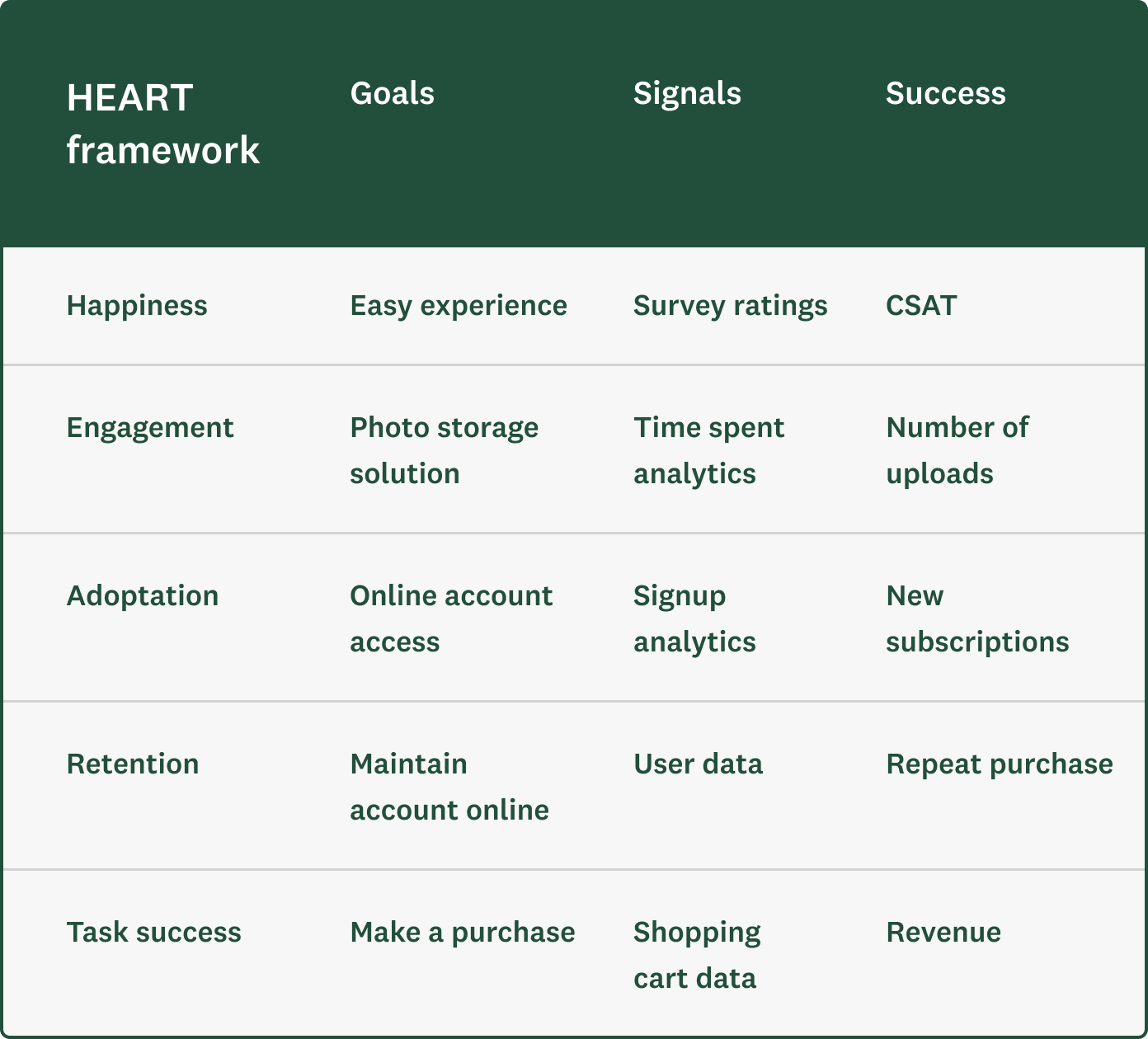
In 2010, Kerry Rodden, Hilary Hutchinson, and Xin Fu wrote a paper about the HEART framework of metrics that they had developed after applying it to 20 products while working at Google. The purpose of the framework is to help you integrate both attitudinal and behavioral metrics. Given that it’s based on work at Google, its focus is on web-based UX, but the framework can be applied to any user experience.
HEART stands for Happiness (satisfaction), Engagement, Adoption, Retention, and Task success. If you look at each description below, you’ll find that, in the end, they are all either attitudinal or behavioral metrics.
- Happiness: includes attitudinal measures like satisfaction, likelihood to recommend, and ease of use
- Engagement: includes some usage metrics, like the number of visits per user per week or the number of photos uploaded per user per day
- Adoption and Retention: include metrics like the number of unique users per time period to distinguish between new (adoption) and existing/returning users (retention)
- Task success: includes behavioral metrics, like efficiency (time to complete), effectiveness (ability to complete, percentage completed), and error rate
You should select metrics that the business cares about and that truly reflect what the user is trying to achieve. Just because a visitor spent an extended period of time on your site does not mean the site experience is great; it could mean quite the opposite—that they’ve been muddling through it for minutes or hours just to do what they are trying to do.
So the next step in the HEART framework is to identify user goals. What are they trying to achieve? How does the product help them accomplish this?
The authors put together a process that helps you:
- State the goals (ex: user outcomes)
- Identify the signals that indicate success (ex: survey ratings, user data)
- Select the identifying metrics to track on your dashboard (ex: CSAT)
When putting together with the HEART framework, it looks like this (and you can find more details here):
Prove the ROI of your user experience efforts
If you want to get the resources–time, human capital, etc.–to design or to improve the user experience, you must link the work to outcomes and show a return on investment (ROI).
Don’t get so deep into the weeds on the many UX metrics that you forget to consider the outcomes for the user and for the business.
What could those outcomes be for the user?
- Ease of use
- Goal completion rates
- Satisfaction/great experience
What outcomes would you like to see for the business?
- Increased conversion rate
- Increased purchases/reduced cart abandonment
- Reduced support volume/costs
- Reduced development costs
- Increased retention and referrals
You’ll need to first define the desired outcomes. Then follow these steps to build the business case to prove the value of your UX program.
Step 1
Identify and define each improvement initiative. Add a description of what it is, what the work entails, and how much it’s estimated to cost. Provide enough details so that the person reviewing it really understands what it is and what time, effort, and resources will be required to implement it.
Step 2
Outline how each initiative will impact the user. How will the customer benefit? How will their experience be different once the improvements are made? In what ways will it create value for them?
Step 3
Executives love metrics. If the improvement is made, which metrics–including employee, customer, and operational metrics–will be impacted? How? How are any of these metrics linked? And how are they linked to outcomes?
Step 4
Explain how that initiative and its benefits will affect or drive business outcomes. Which outcomes? Revenue, conversion, cost savings? How? By how much? Quantify as much as you can.
ROI is sometimes hard to prove directly or causally. There may be other factors in play, including broader changes to the customer experience or to the business that might impact or affect the bottom line. But if you can draw as straight a line as possible between the work and the outcomes, you’ll be better off.
We recommend starting by making the argument that poor design is expensive and improving the user experience not only benefits the users but saves the business a lot of money. Cost savings are often “easier” to start with and to prove.
In conclusion
Peter Drucker, known as the man who invented management, said, “What’s measured improves.” Without the right UX metrics in place, how will you know that the work you’re doing is meaningful and impactful?
Don’t skip out on the opportunity to leverage real-time user feedback. Collect both behavioral and attitudinal metrics to measure, compare, and track the quality of the user experience over time. UX metrics also enable you to demonstrate how your improvements impact both the user and the business.
Discover more resources

Customer satisfaction survey templates
Explore our customer satisfaction survey templates to rapidly collect data, identify pain points, and improve your customer experience.

3 ways to boost business growth by connecting SurveyMonkey and HubSpot
See how users are taking action on survey data to improve customer experience with the SurveyMonkey app for HubSpot.

How to use Forms to enhance your survey experience
How do surveys and forms differ? Learn how to combine form data with survey feedback for seamless events and experiences.

Beyond CX: How SurveyMonkey + Salesforce turn feedback into revenue
SurveyMonkey + Salesforce turn feedback into revenue
Learn how SurveyMonkey can help you exceed customers’ expectations
Speak to an expert today.
Net Promoter® and NPS® are registered trademarks of Bain & Company, Inc., Satmetrix Systems, Inc., and Fred Reichheld.